
Mobile Optimization and Responsive Design: Importance for SEO and User Experience

24 Jul 2023
News, Marketing, Website Development
In today’s world, mobile devices are becoming the primary source of interest access, and economic development organizations need to cater their website to mobile users. With the increasing number of people using smartphones and tablets, website optimization for mobile devices is no longer optional. A website that is not mobile-optimized can lead to a poor user experience, high bounce rates, and lost leads.
Importance of Mobile Optimization
With more people using mobile devices to access the internet than ever, a mobile-optimized website is essential. According to a report by Statista, over 59% of global website traffic comes from mobile devices. If your EDO website is not optimized for mobile devices, you may miss out on more than half of your potential traffic.
Mobile optimization involves designing your website to adapt to different screen sizes and resolutions, making it easier for users to navigate and consume content. It includes optimizing page speed, reducing page size, improving the user interface, and ensuring all website elements are compatible with mobile devices.
The Benefits of Responsive Design
One of the most effective ways to achieve mobile optimization is by using responsive design. A responsive website automatically adjusts its layout and content to fit the screen size of the device being used. It means that whether someone is accessing your website on a smartphone, tablet, or desktop, they will have a seamless and consistent user experience.
Responsive design also offers other benefits:
#1 Improved User Experience
A website that is not mobile-optimized can frustrate users trying to navigate and interact with the content. Responsive design ensures the website is easy to use and provides an optimal user experience, regardless of the device used.
#2 Better SEO Rankings
Google has been using mobile-first indexing since 2018, meaning it now primarily uses the mobile version of a website to determine its ranking in search results. A mobile-optimized website with responsive design can help improve your SEO rankings, increasing visibility and traffic.
#3 Increased Conversions
A mobile-optimized website with responsive design can also lead to increased conversions. When users have a positive experience on your website, they are more likely to engage with your content and take action, such as filling out a form, requesting additional information, or signing up for a newsletter.
Best Practices for Mobile Optimization
Mobile optimization is a continuous process that requires ongoing monitoring and optimization. Here are some of the best practices for mobile optimization.
#1 Optimize Page Speed
Page speed is critical for mobile optimization. Slow-loading websites can lead to high bounce rates and lost leads. You can use tools like Google PageSpeed Insights to identify areas of your website that need optimization to improve page speed.
#2 Simplify Navigation
A mobile-optimized website should have a simple and intuitive navigation structure that makes it easy for users to quickly find what they’re looking for. Limit the number of menu items and ensure that they are easily clickable.
#3 Use Legible Fonts and Colors
Using legible fonts and colors is crucial for mobile optimization. Avoid using small fonts that are difficult to read on smaller screens. Also, use colors that are easy on the eyes and provide a good contrast between the text and the background.
#4 Optimize Images
Images can significantly impact page speed, especially on mobile devices. Ensure all images are optimized for mobile devices and sized appropriately to reduce page load time.
#5 Responsive Design
As mentioned earlier, responsive design is the most effective way to achieve mobile optimization. Ensure your economic development website uses responsive design to provide a seamless user experience across all devices.
#6 Use Mobile-Friendly Forms
Forms are crucial for EDO websites, whether for signing up for a newsletter or registering for an event. Ensure all forms are mobile-friendly and easy to fill out on smaller screens.
Examples & Inspiration for Economic Development Websites
Are you looking for examples and inspiration for mobile-optimized economic development websites? All Golden Shovel websites are mobile-optimized with responsive design. You can view our list of client websites here or check out the view our “Best Economic Development Websites for 2025” here.
More Topics


Featured Work: Government
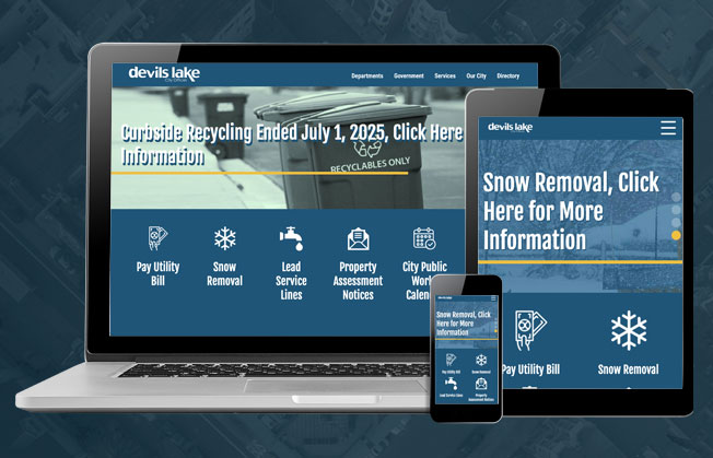
Devils Lake, ND
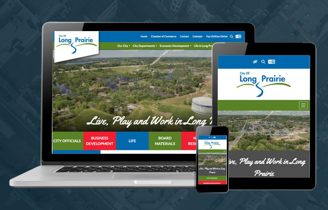
Long Prairie, MN
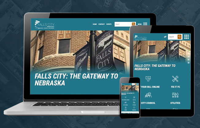
City of Falls City, NE
Get The Economic Developer's Edge Right To Your Inbox